Rich Quigley
Portfolio
w
e
b
f
l
o
w
d
e
v
el
o
p
e
r
g
r
a
p
h
i
c
&
w
e
b
d
e
s
i
g
n
Certified Webflow developer

An intersection of tech and design

Hello! I’m Rich, designer and technogeek. I have extensive experience in both print and web design, including copy editing and prepress along with coding and backend support for standard and CMS based websites, specializing in Webflow. None of my design work is ever really done alone; I’m seeking employment where I can contribute my ever expanding skills to collaborative, results driven projects.

  certifications
Mouse image
digital

website

wheelers

The Goal:
I set out to create a self-promotional website to showcase modern design trends and to specifically demonstrate my Webflow developer abilities, now the primary tool of my current skill set.

The Process:
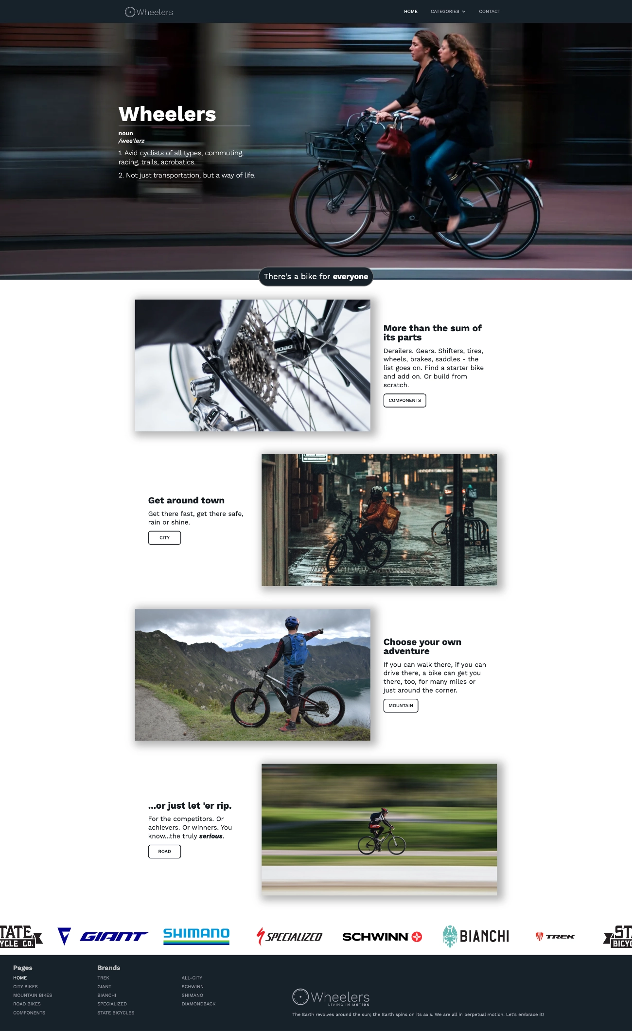
I opted to create a site about bikes and cycling in general as that’s a subject I’m passionate about, particularly commuter bikes. The homepage features images from Pixabay and Unsplash, as are all the site's hero images. The logo is my design, and I wrote the copy on the home page. Lastly, I chose to use a single typeface, Work Sans, as this is becoming increasingly common on sites I’ve seen lately. 

The Result:
I think the site demonstrates the levels of both my design and development skills.

Font:
Work Sans

Tools:
Webflow
Affinity Photo
Affinity Designer

See Site
  See Site
   See Site
iPhone with Wheelers screeniPad Pro with wheelers screen shotiMac with darkened screeniMac with Wheelers screen

website

northern california postal customer council

The Goal:
The primary goal of the Sacramento PCC was to expand their membership, so they began with a name, url and logo update; my task was to redesign the site accordingly and move away from the antiquated CMS Joomla and recreate the site with Webflow.

The Process:
The new logo’s colors are red and indigo, making a white background the best choice. The fonts and hero images were carried over from the current site for continuity. The new name was prominent, this time with a description of the organization, followed by the benefits of the PCC and a CTA, both missing from the site before. Motion graphics were also introduced, giving the site a friendlier feel over all.

The Result:
The site is currently under review for approval.

Fonts:
Nunito Sans

Tools:
Webflow
Affinity Photo
Affinity Designer

See Site
  See Site
Northern California PCC website on an iPhoneDarkened Silver MacBook AirSacramento Postal Customer Council website on a laptop

website

Sacramento PCC

The Goal:
The Sales VP at my job, who served as a Co-Chair of the regional Postal Customer Council, asked me to rework their website to improve the performance and design.

The Process:
First, I needed to learn Joomla and add a few extensions. The front page was reworked firs, starting with consolidating three menus into one, adding rotating hero images, and then breaking up announcements into mobile responsive rows. Global colors and fonts were changed to be more consistent with the brand. I then reworked all other pages.

The Result:
Management was quite impressed at the new look and online membership increase by about 20%. Afterwords, I was named the Communications Chair for this PCC. The following year they received national PCC recognition as the branch with the most innovative communications program in the country.

Fonts:
Nunito Sans
Marcellus

Tools:
Joomla
SP Page Builder
Adobe Photoshop

See Site
Sacramento PCC website on an iPhoneSacramento Postal Customer Council website on a laptop

website

mailing systems, inc.

The Goal:
The company needed a full redesign and rewriting of their WordPress based website.

The Process:
I brainstormed with the VP of operations and he showed me 3 sites to use as sample models. I identified the common factors between those sites as a starting point, and we then bought a design friendly theme to create a few mockups, designing in the browser. I showed the versions to our other designers for feedback, and once we settled on a look I added the content  from the existing site map and  presented the result to management.

The Result:
The VPs and managers were very impressed. This success lead directly to the PCC opportunity (above) and an additional email campaign for the company.

Fonts:
Zilla Slab
Heebo

Tools:
WordPress
Avada Theme
Adobe Photoshop
Adobe Illustrator

See site
  See Site
Mailing Systems, Inc. website on an iPhoneMailing Systems, Inc. website on an iPhoneDarkened Midnight MacBook AirMailing Systems, Inc. website on laptop

wordpress theme

playne

The Goal:
After having mastered and implemented WordPress sites for clients, I wanted to try creating WordPress themes of my own to further enhance my web design skills and add PHP to my skill set.  

The Process:
I first designed and coded the site with HTML, CSS and JS, which were then broken up into sections with PHP then assembled inside WordPress. I also included client customizations such as hero images and side bars. To help achieve a more understated style, I restricted colors to grayscale and added light weight fonts. I also applied a light textured background to make to white "boxes" stand out, further emphasizing content.

The Result:
This, and one other, theme was accepted to the WordPress repository and are still in use today.

Fonts:
Alegreya
Roboto

Tools:
WordPress
Pixelmator
PHP

View Here
  View Here
Display of a sample WordPress theme on an iPadDisplay of a sample WordPress theme on an iPhone
Playne WordPress Thems  website

email campaign

Sierra pacific

The Goal:
I had already been running Sierra Pacific's email campaign when the owner, one of our best clients, wanted to switch to a better service. I recommended MailChimp based on their reputation, and his tech support agreed.

The Process:
I first asked our client to sign up for a MailChimp account and I took it from there, adding the recipient names from his previously list (30,000), and then examined MailChimp's layout tools and sent out a few test emails. I then looked over the management tools for scheduling and lists, learning it all in about 2 hours.

The Result:
MailChimp gave us much better layout control, with all the basic web-friendly fonts, image placement and great tracking.

Fonts:
Open Sans

Tools:
MailChimp
Adobe Photoshop

See email
  See Email
Display of a sample email on an iPadDisplay of a sample email on an iPhone
print
CTEC Annual Report Sample 1CTEC Annual Report Sample 2CTEC Annual Report Sample 3CTEC Annual Report Sample 4

annual report

california tax education council

The Goal:
CTEC asked for a redesign of their annual report with the goal of modernizing it.

The Process:
The previous report had a staid, traditional look, so the first change needed was a stylish sans-serif font. The lime green and indigo were already a part of their branding,  and I made them more prominent. I also gave most elements a layered look throughout.

The Result:
They were pleased with the results as well as the speed; I finished the design in about 2 days, then added content for the first draft by week's end. We thereafter applied the new styles to all marketing pieces, including their quarterly newsletter.

Fonts:
Myriad Pro
Frutiger
Futura

Tools:
Adobe InDesign
Adobe Photoshop
Adobe Illustrator

See pages
  See Report
PCC Sacramento Newsletter CoverPCC Sacramento Newsletter Back
PCC Sacramento Newsletter Inside Pages

newsletter

Sacramento Postal Customer Council

The Goal:
Our goal was to redesign the annual Sacramento PCC newsletter with the new branding established with the website’s recent redesign.

The Process:
I started by incorporating one of the site’s hero images on the front page, using the same Google fonts along with the black and white backgrounds,  and included maroon and light gray as accent colors.

The Result:
After this 2 year rebranding effort, memberships increased by 20% per year, culminating with our first in-person paid event, which was a great success.

Fonts:
Nunito Sans
Marcellus

Tools:
Affinity Publisher
Affinity Photo
Affinity Designer

See newsletter
  See NEWSLETTER
Pulse! Magazine Jazz Feature Layout OpeningPulse! Magazine Jazz Feature Layout Closing

feature layout

jazz at war

pulse! magazine tower records

The Goal:
The goal was to create an effective and pleasing feature article design, the center pieces of Pulse!.

The Process:
The first step in a feature is usually font selection. I chose Debit for heads/subheads as it reflected an avant grade feel for an article about the progressive movement in jazz; note the similarity "J" has to a saxophone. Lennox, used for the pull quotes, is a condensed font, similar to the body copy, but with sharp serifs, edgy enough to compliment the headline. Finally, the lead photo has Jason Moran looking in toward the story's beginning, but also upward like he's envisioning the future of modern jazz.

The Result:
This was my first attempt at a feature story design, earning my stripes to create others with every following issue.

Fonts:
Devit
Lennox
Helvetica Neue LIght Condensed

Tools:
QuarkXPress
Adobe Photoshop
Macromedia Freehand

See pages
  See PAGES
california tax education council annual report sample images

feature layout

shades of David gray

pulse! magazine tower records

The Goal:
To create an effective and pleasing feature article design, the center pieces of Pulse!.

The Process:
David is a pretty classy act, so I elected to try a layout using one typeface, Helvetica Neue, and focus on a smooth and stylish type treatment to catch the eye. Note that his title and byline are colored gray, a visual pun, and the secondary photos are in grayscale.

The Result:
The story was a great contrast to the other surrounding stories, which were quite a bit louder.

Fonts:
Helvetica Neue Extended
Helvetica Neue Light Extended
Helvetica Neue Heavy Extended
Helvetica Neue Black Extended

Tools:
QuarkXPress
Adobe Photoshop
Macromedia Freehand

See pages
Let's talk!
Thank you! Your submission has been received!
Oops! Something went wrong while submitting the form.
Made in Webflow